There is more to data visualization than making data look presentable. Thoughtfully created graphical representations of data provide crispness in the message it’s telling while accelerating the communication of those data insights. Visualization transforms tabular data into information and insights, and provides patterns and stories. The three main goals of data visualization are to help organizations and individuals explore, monitor, and explain insights within data.
Charts, graphs, maps, and infographics allow people to quickly and easily understand and interpret complex data. It also helps identify patterns, trends, and relationships that would not be easily evident in raw data.
Data visualization is integral to data analysis and business intelligence, enabling organizations to make data-driven decisions, see the results, and course correct as needed. Because visual data representations help to convey data and insights more clearly, data visualization is increasingly being used in diverse professions and practices such as journalism, education, research, and even in sports. Data visualization plays a critical role in sharing information and findings in a form that a wider audience can understand.
How to Visualize Data
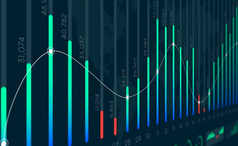
There are many ways to visualize data that take shape in bar charts, line graphs, scatter plots, pie charts, heat maps, and tree maps. How would you know what type of visualization would work best with your data sets? It depends on what needs to be communicated, for what purposes, and to which audiences.
Simple data visualizations can be created using tools such as Microsoft Excel. However, more and more contemporary business intelligence products, such as Tableau, Looker and Qlik allow users to easily build dashboards of tiled data visualizations. Actian Data Platform empowers users to easily load the built-in data warehouse from many data sources and then query and visualize the data.
Visualization is a powerful and effective way to communicate data and gain insights to support better business decision-making. By visualizing tabular data, the user can more easily spot trends, exceptions, and the relative performance of multiple metrics.
Why is Data Visualization Important?
The following eight reasons illustrate why data visualization is valuable for businesses:
- It allows people to quickly and easily understand and interpret complex data and to identify patterns, trends, and relationships that would not be evident in raw data.
- It helps organizations make data-driven decisions by providing a clear and intuitive representation of data and insights and highlighting key information and trends.
- It facilitates the sharing of data and insights with stakeholders in a clear and engaging way.
- Visual information is understandable by a wider audience.
- It aids the discovery and testing of hypotheses using what-if analysis interactively.
- Charts show data elements in context to each other to make it easy to identify and monitor trends and changes over time.
- Historical performance and progress of various key initiatives and metrics are easy to show using visualizations to present and showcase data and insights.
- A shared unified, and comprehensive view of data fosters more collaborative decision-making.
Without visualizations, capturing a point-of-view or a pattern to a larger story would be more difficult. Facts would be less self-evident, and the audience would require more time to interpret a body of data. This makes it harder for business teams to form a viewpoint, build consensus, and trust with key decision-makers and influencers.
Actian and the Data Intelligence Platform
Actian Data Intelligence Platform is purpose-built to help organizations unify, manage, and understand their data across hybrid environments. It brings together metadata management, governance, lineage, quality monitoring, and automation in a single platform. This enables teams to see where data comes from, how it’s used, and whether it meets internal and external requirements.
Through its centralized interface, Actian supports real-time insight into data structures and flows, making it easier to apply policies, resolve issues, and collaborate across departments. The platform also helps connect data to business context, enabling teams to use data more effectively and responsibly. Actian’s platform is designed to scale with evolving data ecosystems, supporting consistent, intelligent, and secure data use across the enterprise. Request your personalized demo.
Data Visualization Stages
The key to a successful data visualization exercise is to distill the interesting points into a concise presentation and put the background into an annex for those who want more details on the topic. The most important thing in a presentation, video, infographic, or article is communicating the salient points to your audience.
There are four stages to creating successful data visualizations:
FAQ
Data visualization is the graphical representation of data through charts, graphs, maps, and infographics that transforms tabular data into information and insights, helping people quickly understand complex data and identify patterns, trends, and relationships.
Data visualization enables organizations to make data-driven decisions by providing clear and intuitive representations of data, facilitating stakeholder communication, and making complex information understandable to a wider audience without requiring technical expertise.
Common visualization types include bar charts, line graphs, scatter plots, pie charts, heat maps, and tree maps, with the best choice depending on what needs to be communicated, for what purposes, and to which audiences.
The three main goals of data visualization are to help organizations and individuals explore, monitor, and explain insights within data.
The four stages are exploration (identifying and gathering data sources), analysis (running queries to find trends and insights), synthesis (charting findings using visualization software), and presentation (embedding visuals and narrative into shareable formats).
Yes, simple data visualizations can be created using Microsoft Excel, though contemporary business intelligence products like Tableau, Looker, and Qlik allow users to build more advanced dashboards and visualizations.
Data visualization helps organizations make data-driven decisions, see results, and course correct as needed by presenting information in a clear way that makes trends, exceptions, and relative performance of multiple metrics easier to spot.